Arctic Sea Ice Downfall

Showing posts with label sea ice area. Show all posts
Showing posts with label sea ice area. Show all posts

Idiotic Denier Of The Day
Some awards come easily to some people and this one for Idiotic mis-interpretation of the evidence is well deserved by Steve Goddard and awarded to him over at uknowispeaksense, full repost below;
 Yes, ok. You got me, my niece would never use such a fat crayon to
draw a graph, unless she wanted it to be fuzzy. This masterpiece is the
work of Steve Goddard who, at his woefully misnamed blog, “Real Science”
is trying to debunk a strawman.
According to Steve, in 2007 AGW proponents, “went hysterical and told
us that the Arctic would be ice free by 2008, 2010, 2012 or 2013″ and
then provided this……..graph to debunk it. Of course, Steve ‘I just
graduated preschool’ Goddard, didn’t provide a reference to these
statements. So some mythical scientists have been debunked. Well done
Steve, well done. You really showed…….them. Of course, my mate Geoffrey
Brown faithfully cut and paste the same graph over
at my favourite denier den, the official blog of the Climate Sceptics
Party and included an admission to being a conspiracy theorist of the
highest order, but that’s for another day.
Yes, ok. You got me, my niece would never use such a fat crayon to
draw a graph, unless she wanted it to be fuzzy. This masterpiece is the
work of Steve Goddard who, at his woefully misnamed blog, “Real Science”
is trying to debunk a strawman.
According to Steve, in 2007 AGW proponents, “went hysterical and told
us that the Arctic would be ice free by 2008, 2010, 2012 or 2013″ and
then provided this……..graph to debunk it. Of course, Steve ‘I just
graduated preschool’ Goddard, didn’t provide a reference to these
statements. So some mythical scientists have been debunked. Well done
Steve, well done. You really showed…….them. Of course, my mate Geoffrey
Brown faithfully cut and paste the same graph over
at my favourite denier den, the official blog of the Climate Sceptics
Party and included an admission to being a conspiracy theorist of the
highest order, but that’s for another day.
So what of this….graph? Well, Steve supplied a link to the data he has used for his blue crayon special and it seems it goes all the way back to 1979. It’s no wonder he cherrypicked the last few years. Here’s a graph or two from the same website. First, what Steve’s magic blue crayon graph would have looked like if he used all the data.

Next, let’s take it back a little further and look at the longer term trend broken down into seasons.
 So,
there you have it. “Real Science” and real science. Which are you going
to accept? Personally, I think I’ll go with the latter. I’m not really
into crayons.
So,
there you have it. “Real Science” and real science. Which are you going
to accept? Personally, I think I’ll go with the latter. I’m not really
into crayons.
Idiotic denier graph of the day, August 26,2012
Yep, something a little different. I got my 3-year-old niece to draw on a piece of paper with a fat blue crayon and this is what she drew.
Conrats Steve Goddard! You have graduated from preschool.
So what of this….graph? Well, Steve supplied a link to the data he has used for his blue crayon special and it seems it goes all the way back to 1979. It’s no wonder he cherrypicked the last few years. Here’s a graph or two from the same website. First, what Steve’s magic blue crayon graph would have looked like if he used all the data.
Next, let’s take it back a little further and look at the longer term trend broken down into seasons.
So,
there you have it. “Real Science” and real science. Which are you going
to accept? Personally, I think I’ll go with the latter. I’m not really
into crayons.
Ruffled Feathers But No lessons Learned
My previous post on the flaws of Goddard's colouring in and counting project seems to have ruffled a few feathers. Within a few hours he made several posts on sea ice extent, but has not learned from his mistakes - in fact he keeps making the same errors over and over.
In this post he is still colouring in but he doesn't rotate the image this time - what was all that about?

And Mr Goddard now proudly states;
But he is still making the same mistakes. I hand you over to Peter Ellis, a real sceptic and someone who has noticed problems with Goddard's analysis and similar problems with this map as I did in my original post. This is his comment to Steven Goddard;
In this post he is still colouring in but he doesn't rotate the image this time - what was all that about?

And Mr Goddard now proudly states;
"My pixel counts agree with Cryosphere Today numbers, which show more excess ice in the Bering Sea, than missing ice in the Barents Sea."I am at a loss as to why he has gone to the trouble of repeating the same flawed exercise to try and get his pixel count to agree with Cryosphere Today. Why not just accept the information on Cryosphere Today? Perhaps because it doesn't suggest that the data "should be showing Arctic ice extent slightly above normal, for the first time in nearly ten years", his original and erroneous claim.
But he is still making the same mistakes. I hand you over to Peter Ellis, a real sceptic and someone who has noticed problems with Goddard's analysis and similar problems with this map as I did in my original post. This is his comment to Steven Goddard;
Peter Ellis says:Perhaps it is time Steven Goddard put his crayons away.
April 19, 2012 at 3:33 pm
You count does not agree with Cryosphere Today numbers, since they show a current overall area anomaly of -0.103 million sq km. You can’t just pick two regions and ignore the rest. As far as your pixel count goes, even by eye I can see you missed some pixels in the Greenland sea. But that omits a larger issue: the pixels that comprise the orange line itself. These (being the border of the ice) presumably are ice-covered in the historical mean data. Since we cannot see through the line, we do not know how many of them are ice-covered today. The orange line is several pixels wide and thousands of pixels long. Your count therefore has a minimum error of several thousand, which makes your entire exercise moot.
Regarding the NSIDC figure, the historical average line is not strictly shifted, it’s actually a subtly different shape, since it’s now based on a 5-day average rather than a 9-day average. If you look carefully you’ll see the line is now slightly less smooth.
What does that do to the overall shape? Well, after normalising and taking the current date as day 0, the April 16 graph shows the average of days (-6,-5,-4,-3,-2,-1-0,1,2) , while the April 18th graph shows the average of days (-4,-3,-2,-1,0). That is, there’s no “shift” in that both are centred on day -2, but there is a difference in the size of the smoothing window.
How does the inclusion of days -6,-5,1 & 2 affect the average? Not at all during parts of the year when the rate of gain or loss is ~ linear. However, during this part of the spring, melt is accelerating, and so days 1&2 are further below day -2 than days -6&-5 are above day -2. So, during this part of the year, the 9-day average will be fractionally lower than the 5-day average.
Taken together, that means that going from the 9-day average to the 5-day average, even when correctly centred, will cause the “average” line to rise fractionally. It’s how smoothing works. The reverse will hold true as the melt slows down in August/September, so as we approach the summer minimum the “new” line for the historical average will be fractionally lower than it was on last year’s graphs.
Another Look At Goddard's Graph Gaffs
Steve Goddard's inability to understand graph data has led to yet another Gaff on his part. He thinks he has discovered more wrong doing, this time by the US National Snow and Ice Data Center.
He takes the Hi resolution map of Sea Ice Extent for the 17th of April 2012 and gets his colouring crayons out again to use a very inaccurate and unscientific method to measure the change in extent form the 1979 - 2000 average. Just like in any good comedy of errors he rather predictably gets it all wrong and the farce continues when he uses errant values support his insinuations of skulduggery. I'm certain a good comedy writer could make a whole series out of the errors and misinformation on 'Real Science'. Perhaps it could be call Goddard's Gaffs, featuring a bumbling shambolic character in front of a monitor trying to save the world from a secret shadowy cabal of men in black that don't actually exist.
Here is how Goddard gets it so wrong - again!
He takes the original map from the NSIDC web site;

And, for some reason turns it around, and gets colouring. To end up with the work of art here;

He then claims to count the red (ice loss) and the green (ice gain) and compare them. He states;

The first ting to notice is that the original image contains over 1.6 million pixels so I doubt very much if 603 pixels is going to be noticeable 'above normal'. But why isn't it showing at least normal?
Well it is all down to 2 gaffs by Goddard. The first is, like any good six year old when it comes to colouring in, they say within the lines, unfortunately they don't always reach the lines sometimes miss bits. Goddard does exactly that as can be seen here indicated by purple and yellow arrows;

To be honest this probably averages out with missing bits that should be either red or green but this is more like child's play than a 'scientific method' and he is only talking about 603 pixels after all.
The biggest error occurs due to his treatment of the orange 'extent line' itself. The NSIDC clearly indicate that the orange line in the extent image is the1979 to 2000 average extent. That means that the outside of the line is the outside of the extent and should be included as red in every red area. Goddard doesn't bother about any such details.
How much difference can such a thin line really make to Goddard's pixel count if he had done it correctly? When zoomed in on the original NSIDC image the orange line is about 5 pixels wide and it will be thousands of pixels long. That is many thousands of pixels that should have been included and would have offset Goddard's mighty 603 pixels 'above normal' even if he had done his colouring to the lines correctly.
Clearly Steve Goddard is wrong again and the Arctic Ice Extent should not be 'slightly above normal' and I would suggest that the graph above represents exactly where it should be.
He takes the Hi resolution map of Sea Ice Extent for the 17th of April 2012 and gets his colouring crayons out again to use a very inaccurate and unscientific method to measure the change in extent form the 1979 - 2000 average. Just like in any good comedy of errors he rather predictably gets it all wrong and the farce continues when he uses errant values support his insinuations of skulduggery. I'm certain a good comedy writer could make a whole series out of the errors and misinformation on 'Real Science'. Perhaps it could be call Goddard's Gaffs, featuring a bumbling shambolic character in front of a monitor trying to save the world from a secret shadowy cabal of men in black that don't actually exist.
Here is how Goddard gets it so wrong - again!
He takes the original map from the NSIDC web site;

And, for some reason turns it around, and gets colouring. To end up with the work of art here;

He then claims to count the red (ice loss) and the green (ice gain) and compare them. He states;
"The area of green is 3544 pixels, and the area of red is 2941 pixels."Which may well be correct, and then uses the difference, a whole 603 pixels to suggest that the sea ice extent must be that much above normal. He then presents the NSIDC graph here to say;
"The NSIDC graph should be showing Arctic ice extent slightly above normal, for the first time in nearly ten years.
Instead, the graph shows well below normal ice extent."
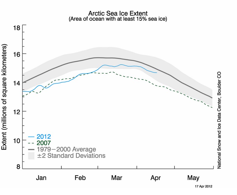
The first ting to notice is that the original image contains over 1.6 million pixels so I doubt very much if 603 pixels is going to be noticeable 'above normal'. But why isn't it showing at least normal?
Well it is all down to 2 gaffs by Goddard. The first is, like any good six year old when it comes to colouring in, they say within the lines, unfortunately they don't always reach the lines sometimes miss bits. Goddard does exactly that as can be seen here indicated by purple and yellow arrows;

To be honest this probably averages out with missing bits that should be either red or green but this is more like child's play than a 'scientific method' and he is only talking about 603 pixels after all.
The biggest error occurs due to his treatment of the orange 'extent line' itself. The NSIDC clearly indicate that the orange line in the extent image is the1979 to 2000 average extent. That means that the outside of the line is the outside of the extent and should be included as red in every red area. Goddard doesn't bother about any such details.
How much difference can such a thin line really make to Goddard's pixel count if he had done it correctly? When zoomed in on the original NSIDC image the orange line is about 5 pixels wide and it will be thousands of pixels long. That is many thousands of pixels that should have been included and would have offset Goddard's mighty 603 pixels 'above normal' even if he had done his colouring to the lines correctly.
Goddard Has Less Sense Than He Did In 1980
Steve Goddard is at it again, showing he has a blind spot when it comes to understanding the significance of a graph. He just carries on with his own selective interpretation of selected data points and ends up not being wrong yet insinuating nothing that is right. I'd call this behaviour 'Cherry Picking'. Am I right?
The graph in question is from his blog post entitled 'Meltdown 2012 : Earth Has More Sea Ice Than It Did In 1980', and although it was posted on the April 1st I'm certain that it wasn't supposed to be as foolish as it seems.
 Goddard includes links to data at ' The Cryosphere Today' site and I am assuming he has graphed the data correctly. Helpfully he rings this years data point and makes the correct claim; " Earth Has More Sea Ice Than It Did In 1980". So what?
Clearly this is an insinuation to some great truth about climate change in the Arctic regions, without saying anything meaningful about them. It appears that he has taken the current value and then hand picked the year furtherest back and at the start of the data set that was lower, i.e. 1980, while gleefully ignoring all other data points in between that might actually be used in determining a meaningful trend or credible conclusion. In fact, by only relying on two data points in a set of 33, he has ignored about 94% of the data to not say anything meaningful - that takes a concerted effort in my book.
Hand picking two data points to the exclusion of all others is how I would define 'Cherry Picking'. However when I mentioned the phase in a comment on Goddard's site he ironically replied;
Does the man realise what he says sometimes? Hand picking a maximum, and ignoring over 90% of all other maximums is cherry picking in my book. He repeats the exact same nonsense here, only lists more years from the 80s, and ignores the clear trends from the mid 90s to the present.
What can we really tell from Goddard's graph? Well there is more sea ice now than most years, and a lot more sea ice than many recent years. So although the sea ice area had recovered on that particular day compared to most years, the clear trend is that global sea ice is of decline when looking at a single day, April 1st, and most of that decreasing trend occurred from the mid 90s with more years than not being lower than this years Fools Day.
The graph in question is from his blog post entitled 'Meltdown 2012 : Earth Has More Sea Ice Than It Did In 1980', and although it was posted on the April 1st I'm certain that it wasn't supposed to be as foolish as it seems.

Clearly this is an insinuation to some great truth about climate change in the Arctic regions, without saying anything meaningful about them. It appears that he has taken the current value and then hand picked the year furtherest back and at the start of the data set that was lower, i.e. 1980, while gleefully ignoring all other data points in between that might actually be used in determining a meaningful trend or credible conclusion. In fact, by only relying on two data points in a set of 33, he has ignored about 94% of the data to not say anything meaningful - that takes a concerted effort in my book.
Hand picking two data points to the exclusion of all others is how I would define 'Cherry Picking'. However when I mentioned the phase in a comment on Goddard's site he ironically replied;
"Cherry picking the current maximum? Are you as dense as you pretend to be?"
What can we really tell from Goddard's graph? Well there is more sea ice now than most years, and a lot more sea ice than many recent years. So although the sea ice area had recovered on that particular day compared to most years, the clear trend is that global sea ice is of decline when looking at a single day, April 1st, and most of that decreasing trend occurred from the mid 90s with more years than not being lower than this years Fools Day.
Subscribe to:
Posts (Atom)