Showing posts with label Global Warming. Show all posts

Wining The Battle, Losing The War

This blog had been pretty inactive as well as the usual reason of being busy with work I also got re-married in that I have now been married for 25 years and decided to do it all again but this time In Las Vegas,  with Elvis of course,  which took a lot of organisation.

I also treated myself to a Nexus 7 tablet which I am slowly writing this on, using an app.  The irony is that I am now probably on the internet more but in less convenient position to knock up a post.

But during my sabbatical I have been thinking that the battle to get the problem of climate change raised and publicly accepted has been won. Unfortunately not purely by the science but the ever increasing record number of weather events now being called Global Weirding or the New Normal. Even before Tropical Storm Sandy caused so much loss in the climate denial stronghold of the US, polls show that concern about climate change was high and most believed that anthropogenic causes do have some responsibility. With Sandy that level of acceptance has only increased and unless we enter into an unlikely prolonged period of climate stability, what the weather will most likely have in store for us will only harden those views. That battle is effectively won.

But the cynic in me worries that the war is being lost or may even already be lost. Even the re-election of Obama,  the only choice if anything can be done to tackle climate change globally,  is little comfort as there seems little appetite with politicians to do anything.  We are in the same position we were in decades ago.  Adaption rather than any attempts at mitigation seems to be favoured and Sandy shows just what we can expect with adaption.

People like me don't need to be alarmist, the conclusions of the science are alarming enough. What to do? We can keep on raising awareness,  keep on confronting denial,  keep on tackling ignorance in the best way we know, but in the end all that effort will pale beside what people are going to experience first hand with floods, droughts, storms and other extremes that are lining up to convince people where sound science has failed for decades. By then the door to mitigating solutions will have closed and adaption will mainly be one of repairing after the damage and the pain has occurred.

Am I wrong to feel that I am looking at the horse bolting?  

Record-High Antarctic Sea Ice Levels Don't Disprove Global Warming

The region's ice has weathered global warming better than Arctic ice

Steve Goddard must be feeling shell shocked. Only a few months ago at the winters peak, the Arctic Sea Ice extent (not volume) was almost normal which he touted loudly on his blog, only to see the fastest melt on record to a new low. With the Battle lost he turns his attention to the Antarctic winter and the growing ice there.

This is a repost from SKYE at weather.aol.com
(Credit: Jeremy Potter NOAA/OAR/OER)
Distracting from the news that Arctic sea-ice extent reached a record low on Sept. 16 is a widely circulating blog article claiming that at the opposite end of the Earth, Antarctic sea ice is more than making up for the losses.

In the post, climate change skeptic and blogger Steven Goddard states that Antarctic sea ice reached its highest level ever recorded for the 256th day of the calendar year on Sept. 12. He reasons that the Southern Hemisphere must be balancing the warming of the Northern Hemisphere by becoming colder (and thus, net global warming is zero).

The National Snow & Ice Data Center (NSIDC), which tracks sea ice using satellite data, explains on its website why Antarctic ice has weathered global warming more robustly than Arctic ice. Goddard dismisses the explanation, concluding instead, "Antarctic and Arctic ice move opposite each other. NSIDC's dissonance about this is astonishing."

Despite its lack of scientific support, Goddard's post has garnered attention around the Web. In a Forbes.com column about the record high Antarctic sea ice, skeptic James Taylor writes, "Please, nobody tell the mainstream media or they might have to retract some stories and admit they are misrepresenting scientific data."

But if anyone had asked an actual scientist, they would have learned that a good year for sea ice in the Antarctic in no way nullifies the precipitous drop in Arctic sea-ice levels year after year - or the mounds of other evidence indicating global warming is really happening.

"Antarctic sea ice hasn't seen these big reductions we've seen in the Arctic. This is not a surprise to us," said climate scientist Mark Serreze, director of the NSIDC. "Some of the skeptics say 'Well, everything is OK because the big changes in the Arctic are essentially balanced by what's happening in the Antarctic.' This is simply not true." [Former Global Warming Skeptic Makes a 'Total Turnaround']

Projections made from climate models all predict that global warming should impact Arctic sea ice first and most intensely, Serreze said. "We have known for many years that as the Earth started to warm up, the effects would be seen first in the Arctic and not the Antarctic. The physical geography of the two hemispheres is very different. Largely as a result of that, they behave very differently."

The Arctic, an ocean surrounded by land, responds much more directly to changes in air and sea-surface temperatures than Antarctica, Serreze explained. The climate of Antarctica, land surrounded by ocean, is governed much more by wind and ocean currents. Some studies indicate climate change has strengthened westerly winds in the Southern Hemisphere, and because wind has a cooling effect, scientists say this partly accounts for the marginal increase in sea ice levels that have been observed in the Antarctic in recent decades.

"Another reason why the sea-ice extent in the Antarctic is remaining fairly high is, interestingly, the ozone hole," Serreze told Life's Little Mysteries. This hole was carved out over time by chlorofluorocarbons, toxic chemicals formerly that were used in air conditioners and solvents before being banned. "The ozone hole affects the circulation of the atmosphere down there. Because of the ozone hole, the stratosphere above Antarctica is quite cold. Ozone in the stratosphere absorbs UV light, and less absorption [by] ozone makes the stratosphere really cold. This cold air propagates down to the surface by influencing the atmospheric circulation in the Antarctic, and that keeps the sea ice extensive."

But these effects are very small, and Antarctic sea-ice levels have increased only marginally. In the coming decades, climate models suggest rising global temperatures will overwhelm the other influences and cause Antarctic sea ice to scale back, too.

The extent of Arctic sea ice at its summertime low point has dropped 40 percent in the past three decades. The idea that a tiny Antarctic ice expansion makes up for this - that heat is merely shifting from the the Southern Hemisphere to the Northern and therefore global warming must not be happening - is "just nonsense," Serreze said.

Idiotic Denier Of The Day

Some awards come easily to some people and this one for Idiotic mis-interpretation of the evidence is well deserved by Steve Goddard and awarded to him over at uknowispeaksense, full repost below;

Idiotic denier graph of the day, August 26,2012

Yep, something a little different. I got my 3-year-old niece to draw on a piece of paper with a fat blue crayon and this is what she drew.
Conrats Steve Goddard! You have graduated from preschool.
Yes, ok. You got me, my niece would never use such a fat crayon to draw a graph, unless she wanted it to be fuzzy. This masterpiece is the work of Steve Goddard who, at his woefully misnamed blog, “Real Science” is trying to debunk a strawman. According to Steve, in 2007 AGW proponents, “went hysterical and told us that the Arctic would be ice free by 2008, 2010, 2012 or 2013″ and then provided this……..graph to debunk it. Of course, Steve ‘I just graduated preschool’ Goddard, didn’t provide a reference to these statements. So some mythical scientists have been debunked. Well done Steve, well done. You really showed…….them. Of course, my mate Geoffrey Brown faithfully cut and paste the same graph over at my favourite denier den, the official blog of the Climate Sceptics Party and included an admission to being a conspiracy theorist of the highest order, but that’s for another day.
So what of this….graph? Well, Steve supplied a link to the data he has used for his blue crayon special and it seems it goes all the way back to 1979. It’s no wonder he cherrypicked the last few years. Here’s a graph or two from the same website. First, what Steve’s magic blue crayon graph would have looked like if he used all the data.


Next, let’s take it back a little further and look at the longer term trend broken down into seasons.
So, there you have it. “Real Science” and real science. Which are you going to accept? Personally, I think I’ll go with the latter. I’m not really into crayons.

Scraping A Barrel

"The forecast high for Rock Rapids, Iowa tomorrow is 84 degrees. It was 109 degrees on the same date in 1936. Experts tell us that 2012 is hotter than 1936."
This is what passes for a credible post on Real Science. I seriously hope that anyone capable of reading it has enough critical facilities to see the desperate cherry pick that it is.


Northern Hemisphere’s shifting curve.

Steve Goddard and others are having a hard time deflecting attention from climate change with the weather extremes that are occurring around the world this year and people are starting to notice. They have been scouring the records to find a headline to mislead with. Here is an example for the Orwellian 'Real Science'; 'US Summers Getting Cooler Since 1895', and it even comes with a graph to prove it;

This certainly indicates a decline in the summer temps shown so how can there be more climate extremes now? The answer is in the graphs title, 'Summer Maximum Temperatures' and I was going to do a long post on it but when I found it has been explained rather well over at 'uknowispeaksense', I thought plagiarism is so much easier than origionality so I will let them take up the story;

I’ve already had one commenter in here point out a bunch of cherrypicked individual high temperature records from all sorts of places and from different times and asking me how there can be new extremes as reported by James Hansen if these records haven’t been broken. Of course Hansen’s data is dealing in average temperatures not indivdual records. As the average temperatures increase the bell curve shifts to the right indicating that on average, extreme highs will increase and extreme lows decrease. Without bothering to check the credibility of the data that suggests that in Seville, Spain on August 4, 1881 it was 122 degrees F, and assuming it is correct, my question is, so what? We are not dealing with individual time points here, we are dealing with decadal averages. That said, here’s the thing, average global temperatures are rising. That fact is indisputable. That also means maximum temperature anomalies and outliers will continue to be superceded. It is inevitable. Continuing to try and muddy the waters with erroneous outliers just demonstrates how desperate deniers are to hang on to their evermore untenable positions. It is sad.

Here is a page with some excellent graphics. The first, showing the increasing number of “hot” and “very hot” summers in the northern hemisphere and the second, the graphic highlighting the shift to the right.
http://www.nasa.gov/topics/earth/features/warming-links.html


Goddard Gets Hot Under the Collar

Mr Steve Goddard is getting hot under the collar and it's not only due to the terrible wild fires in Colorado, it's the result of the media highlighting the possibility that the wild fires may have been exasperated due to global warming.

So much so he is again misleading his, largely ignorant, following on his blog. It's uncertain if he does this deliberately or through his own basic ignorance - it's difficult to tell, but both James Hansen and Phil Jones get targeted by his nonsense - I mean his 'theory' - that they are wrong because temperatures have not increased in Boulder Colorado so global warming cant be linked to these wild fires.

The thing is, it doesn't take much on an intellect to realise that temperature isn't the main factor in wild fires, it's drought. Temperature isn't even the main factor in drought, it lack of water. So what does current drought conditions for Colorado look like;

It went from this;


To this in just over two months;


But Mr. Goddard isn't likely to reveal this to his readers any time soon.

Real Science Proves Hansen Correct Again.

In a Real Science post, as usual aimed more at right wing politics than real science, Steve Goddard quotes James Hansen from 1986;
"Within 15 years, said Goddard Space Flight Centre honcho James Hansen, "global temperatures will rise to a level that hasn't existed on Earth in 100,000 years"
 Mr Goddard should look rather foolish as Hansen was right. Antarctic Ice Cores from Vostok  revealing temperatures going back 800,000 years show that present temperatures are warmer than at any time in over the last 100,000 years. This is something that was unknown to science back in 1986, so whether Hansen made a lucky guess or an inspired one, he was right.

This figure shows historical CO2 (right axis) and reconstructed temperature (as a difference from the mean temperature for the last 100 years) records based on Antarctic ice cores, providing data for the last 800,000 years.
 
This isn't the fist time Goddard has shown Hansen to be correct even though he remains in denial. Like many foolish people Goddard doesn't know when to quit and his defence of this evidence is to incorrectly insist that;
"According to ice cores, temperatures peaked 8,000 years ago"
 This is an old denier fallacy which was promoted by people like Don Easterbrook and long debunked by sites like Skeptical Science. 8000 years was a warm period and Easterbrook presented graphs like this one that that showed just that;


But as can be clearly seen, Easterbrooks 'present ' times stopped in 1855 just as current global temperatures started to rise. It would be rather inconvenient for a science denier to include modern temperatures and highlight that present warming really is at an unprecedented high, not seen for many thousands of years. Clearly Goddard and his other foolish promoters of myths are living in the past as current average global temperatures are higher than 8000 years ago and as shown higher than over 100,000 years ago just as Hansen said they would be.
 "There are two kinds of fools: those who can't change their opinions and those who won t."

Fox News Can't Decide if Climate Change is for Real

A mirrored post from Christopher "Tanoro" Grays' blog; A Personal blog of science and reason

Just last week, I was arguing with someone on Facebook that when an organization with a clear-cut bias that claims to report the news cannot even get its own position straight, we should become less inclined to take said organization seriously. At the time, I was talking about NaturalNews.com, the Fox News of alternative health. This time, it's Fox News doing what it does best.
My boss told me this morning that Fox News released an article indicating that new research shows that wind farms may cause global warming.
New research finds that wind farms actually warm up the surface of the land underneath them during the night, a phenomena that could put a damper on efforts to expand wind energy as a green energy solution.
The title of the article is very misleading and doesn't quite reflect what the study's author actually said.
"Overall, the warming effect reported in our study is local and is small compared to the strong year-to-year changes" that result from natural variation, said Liming Zhou.
This means that a big enough wind farm could cause small, but noticeable, change in local meterology, a warming effect quantified in the study as 0.72°C per decade in the regions containing such wind farms. That doesn't mean climate change! As usual, Fox News is trying to sensationalize the story.
What I find troubling, however, is what story was right below this one on Fox News' homepage.
The article highlighted here discusses a blog by climate change denier, Steven Goddard, a former guest author on WattsUpWithThat. The blog questions whether or not greenhouse gases cause severe weather patterns attributed to climate change. Now, this is not a topic with which I am familiar, so I cannot comment on it. What I found most laughable is the author's introduction in the Fox News article.
Steven Goddard, who runs the skeptical climate blog Real Science and has a background in geology and computer science, has spent thousands of hours studying bad weather events around the world.
What is wrong with this picture? First of all, Fox News is quoting an expert in geology and computer science on the subject of meterology and climatology? I can actually hear my brain cells shriek in pain.

Secondly, Fox News has no trouble spelling out the pseudo-science claptrap of the anti-science minorities, but they fall flat on their faces when trying to transmit a simple message from the peer reviewed literature. What's worse, the message they successfully conveyed is by a stark opponent against climate change while the headliner is an article suggesting alternative energy causes climate change. Fox News, if I "head desked" everytime you got something hopelessly wrong, I'd have brain damage that strongly correlates with the frequency in which I read your content.

Sources:
http://www.nature.com/nclimate/journal/vaop/ncurrent/full/nclimate1505.html
http://grist.org/list/wind-farms-do-not-cause-climate-change/
http://www.foxnews.com/scitech/2012/04/30/wind-farms-are-warming-earth-researchers-say/
http://www.foxnews.com/scitech/2012/04/30/proof-global-warming-isnt-making-weather-wackier/

Hitler Liked Dogs. Do You?

I have been following the news of Heartland's ill judged ad campaign. I'd say ill judged only if you consider shooting yourself in the foot while it is in your mouth, ill judged.  Didn't they learn anything from the not funny satirical 10:10 ads?

By pretty much suggesting that those who accept the science of global warming are like serial killers and terrorists they have managed to alienate supporters and funders alike. Drink giant Diageo who owns brands like Guinness, Smirnoff, Johnnie Walker and Moët & Chandon and gave Heartland $10,000 over the past two years say they have no plans to work with the Heartland Institute in the future. State Farm an insurance company has also announced that they were severing all ties with the Heartland Institute.This company gave $114,000 in 2010, $230,000 last year and $95,000 this year according to Heartland's leaked fund-raising plan. Ouch!

'my participation in the upcoming Heartland conference has now become untenable.' With her book being advertised on the same Heartland web page she believes her ' reputation has been harmed'. She also reports;
'Ross McKitrick said in an a strongly-worded letter to Heartland yesterday:
You cannot simultaneously say that you want to promote a debate while equating the other side to terrorists and mass murderers.'
Perhaps more can be learned about the ethics and morals of those who appear to see nothing wrong with this sort of campaign. Enter stage left my Member of the European Parliament, Roger Helmer. He became an MEP on a Conservative ticket before defecting to the more extreme right UKIP party who has for a deputy leader Mad Monckton. Helmer has been mentioned on my blog before;
Who voted for this idiot?
Rape victims share responsibility for the crime!
Winds of Change?

Helmer is still down to attend this Heartland conference as a breakfast speaker;
"Breakfast - May 23, 2012: SPEAKER, Roger Helmer, European Parliament, Great Britain - $39.00 "
By all accounts this insidious Ad campaign is no barrier to him giving his speech. According to Leo Hickman;
'He confirmed he was still attending, adding:
I am delighted that the Heartland campaign for the Chicago climate conference has succeeded in its purpose and attracted the attention of the Guardian.'
So with Helmer and his conservative opinions in mind I thought I'd give Heartland a few suggestions for alternatives to their posters. This ones for Rog;


 But Heartland's ads are really a reverse version of the Appeal to Authority. Choose someone who is noteworthy in some respect and use them to promote something unrelated. I can't see dairy farmers being too pleased to see this around the country;


Or, as the title of this post suggests, dog breeders liking this;


But to really show the absurdity and irrationality of this add campaign, suppose an environmental group had commissioned this;


Normal Service Has Been Resumed

After the hack at Steven Goddard Orwellian named 'Real Science' web site that resulted in no posts for several days, normal service has been resumed.

The latest post still rejects science and rationality. It still denies global warming is happening. It still promotes conspiracies including '“Global Warming” to scare the masses and make lots of money while controlling nations'.

The only real difference is that this post isn't from the guy who calls himself Steven Goddard, he still seems to have lost control of his domain, but by someone calling themselves Richard Garwin.

There is a rather eminent physicist called Richard Garwin, now 84 years old, and a Board member of the Union of Concerned Scientists, but this clearly isn't Goddard's hacker.


The post has received quite a lot of interest form Goddard's usual commenters but they seem unhappy with it for some reason and I can't quite put my finger on what it is. Perhaps this Richard Garwin is slightly more extreme in his conspiracy theories with talk of Elitists, Weather Control and UFOs, but it hardly makes less sense that Goddard's 'Birther' conspiracies for example. But what is assured is that their ability to think rationally remains just as impaired;

'Ano' suspects the hack could be down to the warmists;
I would suspect it might be a guy from Desmog Blog. This is their kind of thing
 'Dave Burton' agrees;
I suspect that the person impersonating Richard Garwin is a climate alarmist having some fun at skeptics’ expense.

Meanwhile, normal service has been resumed by Steve Goddard himself over at his old Worprdpress blog where his own anti-science, conspiracy theory nonsense continues.

Unfortunately so does the nonsense that the hack was an attack carried out by the warmists, 'ntesdorf' says:
Dirty tricks are all that the Warmists really know.
  And 'Rogelio' says:
I still think that that site was stolen because it is and was really doing major damage to the AGW. I cannot possibly contemplate any other reason
Apparently it was even believed that Richard Garwin the physicist, was responsible for the hack, 'foxgoose' says;
Is he really a Board Member of the Union of Concerned Scientists?
Hilarious!
Obviously they’re a lot more “concerned” than we thought.

 All this despite Goddard's best efforts and continued claims that this incident has nothing to do with either. You really could not make this stuff up.

Real Science Hacked

It appears that someone has got control of the Real Science Blog and posted an announcement of Steve Goddard's death at the age of 81.

From what I can tell from posts on the likes WUWT, the person going under the name of Steven Goddard is fine but has lost access to his own blog for now at least. I hope he gets it back soon.

The hacked site claims that there will be no posts today out of respect so it will be interesting to see what if anything is posted tomorrow if the hackers still have access. Comments to the site are moderated so news of the hack and the true state of Steve's well being never appear. It must be weird seeing your own messages of condolences.

I immediately suspected something was amiss as the announcement claimed Steve Goddard was a scientist, and I'm not being unkind but as far as I know he has never claimed to be a scientist.

Ruffled Feathers But No lessons Learned

My previous post on the flaws of Goddard's colouring in and counting project seems to have ruffled a few feathers. Within a few hours he made several posts on sea ice extent, but has not learned from his mistakes - in fact he keeps making the same errors over and over.

In this post he is still colouring in but he doesn't rotate the image this time - what was all that about?


And Mr Goddard now proudly states;
"My pixel counts agree with Cryosphere Today numbers, which show more excess ice in the Bering Sea, than missing ice in the Barents Sea."
 I am at a loss as to why he has gone to the trouble of repeating the same flawed exercise to try and get his pixel count to agree with  Cryosphere Today. Why not just accept the information on Cryosphere Today? Perhaps because it doesn't suggest that the data "should be showing Arctic ice extent slightly above normal, for the first time in nearly ten years", his original and erroneous claim.


But he is still making the same mistakes. I hand you over to  Peter Ellis, a real sceptic and someone who has noticed problems with Goddard's analysis and similar problems with this map as I did in my original post. This is his comment to Steven Goddard;

Peter Ellis says:
April 19, 2012 at 3:33 pm

You count does not agree with Cryosphere Today numbers, since they show a current overall area anomaly of -0.103 million sq km. You can’t just pick two regions and ignore the rest. As far as your pixel count goes, even by eye I can see you missed some pixels in the Greenland sea. But that omits a larger issue: the pixels that comprise the orange line itself. These (being the border of the ice) presumably are ice-covered in the historical mean data. Since we cannot see through the line, we do not know how many of them are ice-covered today. The orange line is several pixels wide and thousands of pixels long. Your count therefore has a minimum error of several thousand, which makes your entire exercise moot.

Regarding the NSIDC figure, the historical average line is not strictly shifted, it’s actually a subtly different shape, since it’s now based on a 5-day average rather than a 9-day average. If you look carefully you’ll see the line is now slightly less smooth.

What does that do to the overall shape? Well, after normalising and taking the current date as day 0, the April 16 graph shows the average of days (-6,-5,-4,-3,-2,-1-0,1,2) , while the April 18th graph shows the average of days (-4,-3,-2,-1,0). That is, there’s no “shift” in that both are centred on day -2, but there is a difference in the size of the smoothing window.

How does the inclusion of days -6,-5,1 & 2 affect the average? Not at all during parts of the year when the rate of gain or loss is ~ linear. However, during this part of the spring, melt is accelerating, and so days 1&2 are further below day -2 than days -6&-5 are above day -2. So, during this part of the year, the 9-day average will be fractionally lower than the 5-day average.

Taken together, that means that going from the 9-day average to the 5-day average, even when correctly centred, will cause the “average” line to rise fractionally. It’s how smoothing works. The reverse will hold true as the melt slows down in August/September, so as we approach the summer minimum the “new” line for the historical average will be fractionally lower than it was on last year’s graphs.
Perhaps it is time Steven Goddard put his crayons away.


Another Look At Goddard's Graph Gaffs

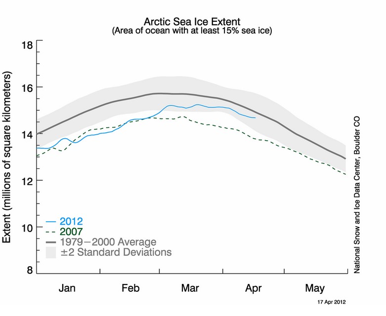
Steve Goddard's inability to understand graph data has led to yet another Gaff on his part. He thinks he has discovered more wrong doing, this time by the US National Snow and Ice Data Center.

He takes the Hi resolution map of Sea Ice Extent  for the 17th of April 2012 and gets his colouring crayons out again to use a very inaccurate and unscientific method to measure the change in extent form the 1979 - 2000 average. Just like in any good comedy of errors he rather predictably gets it all wrong and the farce continues when he uses errant values support his insinuations of skulduggery. I'm certain a good comedy writer could make a whole series out of the errors and misinformation on 'Real Science'. Perhaps it could be call Goddard's Gaffs, featuring a bumbling shambolic character in front of a monitor trying to save the world from a secret shadowy cabal of men in black that don't actually exist.

Here is how Goddard gets it so wrong - again!

He takes the original map from the NSIDC web site;


And, for some reason turns it around, and gets colouring. To end up with the work of art here;


He then claims to count the red (ice loss) and the green (ice gain) and compare them. He states;
"The area of green is 3544 pixels, and the area of red is 2941 pixels."
Which may well be correct, and then uses the difference, a whole 603 pixels to suggest that the sea ice extent must be that much above normal. He then presents the NSIDC graph here to say;
"The NSIDC graph should be showing Arctic ice extent slightly above normal, for the first time in nearly ten years.

Instead, the graph shows well below normal ice extent."


The first ting to notice is that the original image contains over 1.6 million pixels so I doubt very much if 603 pixels is going to be noticeable 'above normal'. But why isn't it showing at least normal?

Well it is all down to 2 gaffs by Goddard. The first is, like any good six year old when it comes to colouring in, they say within the lines, unfortunately they don't always reach the lines sometimes miss bits. Goddard does exactly that  as can be seen here indicated by purple and yellow arrows;


To be honest this probably averages out with missing bits that should be either red or green but this is more like child's play than a 'scientific method' and he is only talking about 603 pixels after all.

The biggest error occurs due to his treatment of the orange 'extent line' itself. The NSIDC clearly indicate that the orange line in the extent image is the1979 to 2000 average extent. That means that the outside of the line is the outside of the extent and should be included as red in every red area. Goddard doesn't bother about any such details.

How much difference can such a thin line really make to Goddard's pixel count if he had done it correctly? When zoomed in on the original NSIDC image the orange line is about 5 pixels wide and it will be thousands of pixels long. That is many thousands of pixels that should have been included and would have offset Goddard's mighty 603 pixels 'above normal' even if he had done his colouring to the lines correctly.

 Clearly Steve Goddard is wrong again and the Arctic Ice Extent should not be 'slightly above normal' and I would suggest that the graph above represents exactly where it should be.

Steve Goddard Goes Full Stupid

In a post entitled 'CSM Goes Full Stupid', Steve Goddard shows that he doesn't really want to know about any research that might undermine his ideological beliefs.

This is another post from him about the Shakun el al paper, 'Global warming preceded by increasing carbon dioxide concentrations during the last deglaciation', as reported in The Christian Science Monitor.

I have already posted on his immature treatment of this research and here he manages to under achieve compared to even that initial poor standard.

In his post he states;
"Antarctica … temperature increases … led … CO2"
To the exclusion of all other data in the research. In the comments he insists;
"Shakun is not disputing the ice core data. Unless he can prove that ice core data is wrong his claims are as daft as you. "
This research looks at a total of 80 climate proxies dating back to the last deglaciation as mapped in Figure 1 of the paper;


Because previous research had really only considered Antarctic proxies, (there are four considered in the paper), and showed temperate leading rising CO2 levels,  Goddard refuses to accept the other 76 data sets because they are not telling him what he wants to believe.

Just to clarify his position, he is cherry picking just 5% of the data that confirms is ideological bias and is rejecting 95% of the data that might disagree with it!

I have now had a look at the full paper, (Thanks to Chris at Dosbat for the direct link), and the  sequence of events that caused warming temperatures to lead CO2 in the Antarctic has been established.

Basically, Milankovitch cycles warmed the planet, just like the science has always said. This resulted in more Southern Hemisphere warming overall, which is why the Antarctic cores show warming first. This released CO2 from the oceans, which is why CO2 lags temperature in the Antarctic cores. The released CO2 was an additional driver of further warming, now globally, which is why the other proxies show this.

The basic science has not changed. Shakun’s paper just fills in some details, but clearly Goddard doesn’t want to understand the research.

For far better reviews of this paper instead of the rather simplistic view I have given here I recommend both  Dosbat and Skeptical Science.

Goddard’s Great Arctic Conspiracy


Steve Goddard has a conspiracy theory, Arctic Fraud, that he posted on the 9th of March 2012. I think I do remember scanning this at the time but ignored it as the usual worthless scaremongering that occurs with great frequency on his blog.

But then on of his commentators referenced it in reply to me to suggest this was a great discovery and I though that I’d have another look at it. If some of his readership took it seriously, regardless of how confused they may seem, others might as well.

Goddard claims that the whole ‘fraud’ was uncovered when "Thanks to the work of skeptics, two key government documents have been dug up ".  Hidden documents revealing a global fraud that were dug up due the fearless dedication of climate 'skeptics' -this is scary stuff.

The first of these hidden documents is a graph of Arctic sea ice extent and was uncovered in 'Climate Change the IPCC Assessment' from 1990 ... Hang on a moment – a 1990 IPCC report? How much digging up did that take? It’s probably been on the IPCC web site for, like decades now. They can't be very good at hiding their fraud if they just let anyone with an internet connection access to it – but then these ‘skeptics’ must be pretty useless at spotting it since it’s been right under their noses for about 22 years, don’t they read science? Oh I forgot, of course they don’t.

Actually this IPCC report is well referenced by ‘skeptics’ who often post this graph from it on page 202;


It seems to appear every time a Prof. Michael Mann’s ‘Hockey Stick’ graph of global temperatures is referred to as ‘proof’ that the Medieval Warm Period has been fraudulently erased from history – but that is another level of bunk I won’t go into here.

The first piece of evidence for Goddard’s fraud is a graph of sea ice extent anomaly, and can be ‘dug up’ on page 224. This is Goddard’s version of it;


For some reason that I can’t entirely understand, (perhaps someone in the know can help me out), he adds red bits and shows where proper satellite monitoring starts and where the value of ice is high. Is he trying to suggest that the US government at the time, (Carter was president), spent billions of dollars putting, keeping and monitoring satellites in orbit, to fraudulently inflate sea ice area then gradually bring it down over decades, (about 40years and counting), so that sometime in the future, when goodness knows who would be in government, it can be used as evidence for global warming and an excuse for increases in taxation, a new world order or something sinister based on a long perpetrated fraud? Perhaps Goddard’s red markings are there for some credible reason but it escapes me.  

Anyway I think Goddard’s ‘smoking gun’ from this graph is that sea ice was low back in the day and it is low now. But that graph is only part of a series;


We can see that while the Arctic starts fairly low and rises, the graph below for the Antarctic shows the ice high and falls. So global sea ice can't be considered anomalously low. How lame a fraud is that? Surely if you want to suggest that the ice is decreasing globally you keep both poles high at the start? Don’t these conspirators know nothing?

Seriously, it can be seen from considering both these graphs, pre satellite, that global sea ice was not low. But it also suggests that pre satellite measurements had much higher levels of uncertainty. That is way satellites were launched with a mission to measure ice area – not to inflate the figure but to get a more accurate measure. The first graph in the series shows a gradual decline in snow extent during the same period.

During the research of this post I came across another blog, ‘More GrumbineScience’, that does a far more rigorous examination of exactly what is in the 1990 IPCC report regarding sea ice extent. It explains exactly how the ice was measured at the time compared to more recent measurements. I'd recommend it for anyone interested in the facts - clearly Goddard has never read it.

So Goddard’s ‘Arctic Fraud’ isn’t of to a great start. The first key piece of evidence uncovered was freely available for decades and just shows the state of knowledge at the time.

But what of Goddard’s second key piece of evidence for a fraud. It is much more scary – a document from the CIA! This is a 1974 report by the CIA called "A study of climatological research as it pertains to intelligence problems". It was apparently dug up by in 2009. Was it uncovered by a  whistle blower? Was there a hack of the CIA servers? Is any body's life in jeopardy?
Well no. It was got from the British Library, where no doubt it has been for decades and open to the public for scrutiny. In fact it is available from several places on-line - it can be purchased from here for example. This document isn’t entirely unknown either. It is often cited as evidence every time the ‘Scientists thought there would be global cooling in the 70’s’ meme is brought up. So I can’t help wonder if this document was dug up and revealed in ‘skeptic’ circles in 2009, and the first document has been freely availably for decades, why it has taken Steve Goddard about 3 years to reveal his great Arctic conspiracy fraud? Perhaps he was fact checking? – Sorry, I must try to tone down the sarcasm.

Goddard’s ‘smoking gun’ from the CIA report is the line;
 Early in the 1970s a series of adverse climatic anomalies occurred;
  • The worlds snow and ice cover had increased by at least 10 to 15 percent.
That is further used by him to suggest that sea ice was also low back in our recent past. But this isn’t a scientific report. In fact the science in it is dodgy at best. It was commissioned and written during the cold war and at a time when the media were hyping the idea of global cooling, and when Arctic sea ice had been increasing. This is clearly part of the series of events that occurred in the 1970s, unusual enough at the time for the somewhat paranoid CIA to worry about possible 'intelligence problems'.

If the CIA had taken time to ask the scientific community the general direction the near future climate was expect to take was one of warming, not cooling.

So looking at all the evidence that has been ‘dug up’, can any one rationally say there is any credible evidence for a fraud? Isn’t it more like another case of doubting the research based on ignorance and bias by a fantasist?

Goddard Has Less Sense Than He Did In 1980

Steve Goddard is at it again, showing he has a blind spot when it comes to understanding the significance of a graph. He just carries on with his own selective interpretation of selected data points and ends up not being wrong yet insinuating nothing that is right. I'd call this behaviour 'Cherry Picking'. Am I right?

The graph in question is from his blog post entitled 'Meltdown 2012 : Earth Has More Sea Ice Than It Did In 1980', and although it was posted on the April 1st I'm certain that it wasn't supposed to be as foolish as it seems.

Goddard includes links to data at ' The Cryosphere Today' site and I am assuming he has graphed the data correctly. Helpfully he rings this years data point and makes the correct claim; " Earth Has More Sea Ice Than It Did In 1980". So what?

Clearly this is an insinuation to some great truth about climate change in the Arctic regions, without saying anything meaningful about them. It appears that he has taken the current value and then hand picked the year furtherest back and at the start of the data set that was lower, i.e. 1980, while gleefully ignoring all other data points in between that might actually be used in determining a meaningful trend or credible conclusion. In fact, by only relying on two data points in a set of 33, he has ignored about 94% of the data to not say anything meaningful - that takes a concerted effort in my book.

Hand picking two data points to the exclusion of all others is how I would define 'Cherry Picking'. However when I mentioned the phase in a comment on Goddard's site he ironically replied;
"Cherry picking the current maximum? Are you as dense as you pretend to be?"
Does the man realise what he says sometimes? Hand picking a maximum, and ignoring over 90% of all other maximums is cherry picking in my book. He repeats the exact same nonsense here, only lists more years from the 80s,  and ignores the clear trends from the mid 90s to the present.


What can we really tell from Goddard's graph? Well there is more sea ice now than most years, and a lot more sea ice than many recent years. So although the sea ice area had recovered on that particular day compared to most years, the clear trend is that global sea ice is of decline when looking at a single day, April 1st, and most of that decreasing trend occurred from the mid 90s with more years than not being lower than this years Fools Day.


Biography of a Liar?

The release of funding information for the Heartland Institute has revealed some interesting things about scientists who oppose the scientific consensus on Anthropogenic Change.

One Such scientist is Robert (Bob) M. Carter a research professor at James Cook University, Queensland, Australia. He is a geologist more than a climate scientist who has as published newspaper articles which conflict with the mainstream scientific opinion on climate change.

But currently on the web he specifically states;
"He receives no research funding from special interest organisations such as environmental groups, energy companies or government departments."

He may want to edit this information because the Heartland documents reveal that he will receive $1,667 per month for his work on the Nongovernmental International Panel on Climate Change (NIPCC) an opposing document to the Intergovernmental Panel on Climate Change (IPCC) reports.

It is worth remembering that the thousands of scientists and other experts contribute to the IPCC reports by writing and reviewing reports do so on a voluntary basis, without payment from the IPCC.

So the question is this man a liar or has he found a coping strategy to allow him so believe that he receives no funding from special interest organisations, while receiving over $20,000 a year from the Heartland Institute whose mission is to "discover, develop, and promote free-market solutions to social and economic problems"? Perhaps the 'research' clause will be enough while he just pockets the money?

Cold reduces snowfall

Yep, that's right in the world according to Goddard.


In one of the  dumbest things I have seen on his site - it its had plenty of competition. Commenting about current snow fall in the US  he states with authority that "the cold areas have also had record snowfall. Climate experts tell us that cold reduces snowfall, because there is less water vapour in the air."

I suppose that the concept of warmer wetter air cooling and the moisture falling out as snow is beyond his comprehension.

I await the flaming comments over there about how stupid and uneducated I am.

Heartland-gate

Breaking news in the climate denial front. The 'Think Tank', The Heartland Institute who has always been very secretive about both it's funding and who it in turns funds has had an Insider release the Heartland Institutes budget, and fund-raising plan. Already some quite interesting revelations are coming to light across this interweb thingy;

Links to the released documents are available there "so that others can also scrutinize the documents and bring their expertise to the task".

Should be interesting and may be a blow for the Denial Machine.

 UPDATE 

Reviews of the documents in this leak are coming in thick and fast and some from very credible sources like Scientific American:

Sea level has been declining for several years, and is lower now than it was in 2003

That is one of the claims Goddard makes in his 2012 Global Warming Report Card. I have already looked at all his 19 points but some are worth examining in more detail, if only because he has emailed me in an accusery tone saying how I ‘compulsively focused on two of them’.

As stated I did a whole post on all of them and found them all to be lacking, but the ‘two’ are his cherry picked claims about cooling in Greenland, that were taken apart by Kevin O'Neill, see Update for Metric 5, and mypost on why he would go to such lengths to doctor a chart. He later had to admit he made a silly error in that attempt – though at this point he has yet to correct the error in the original post. But worse, this ‘report card’ without correct of an error Goddard admits to, is now being made widely available through that great scientific bastion of truth the ‘Science & Public Policy Institute’, (SPPI),  in downloadable PDF form claiming;
“The massive bulk of evidence indicates that nothing is wrong, and that Hansen, Mann and the rest of the hockey team are not being honest with us.”
I have emailed ‘bferguson’ from the 'Contact' information at SPPI, and asked if it will be corrected. Several days and no reply. So who is ‘not being honest with us’?

So now it is time to compulsively focus on a third

The claim that ‘Sea level has been declining for several years, and is lower now than it was in 2003’ is supported by a graph of unadjusted sea level data from Envisat and a link to that data.


I have used Excel to reconstruct Goddard’s graph so that I can look more sceptically at his claims. A trend line clearly shows that even over such a short time period the trend is definitely up.


Goddard’s first claim, that sea level has been declining for several years, looks like a straight forward lie even using his own graph. I cannot not figure out anyway a mind, even Goddard’s, can come to this conclusion, even by another mistake. The max sea level every year, from 2003 to 2010 has been higher than 2003. Which are the several years he believes have declined?  It can only be deliberate misrepresentation. 
 
The Envisat data set is currently so short it is difficult to tease out any really significant conclusions. But I’m sure that is precisely why Goddard favours it. The real story of sea level rise can be obtained for the same web site this data comes from, which Goddard ignores, and the overall and continuing trend is obvious for all but the closed minded to see.
 
As a side note, I was told with great authority on another  blog that attracts 'skeptics' that sea level was now below the trend line as if this evidence was of great significance. I had to point out that it was an average trend line - it will be below it about 50% of the time!
 

 A Cherry Picking Moment

Goddard’s claim the sea level is now lower than 2003 is the classic cherry pick. We actually know almost nothing about the sea level in 2003 as the data only represents the immediate end of that year. But I will give him some leeway and assume he means the start of 2004. It is such a classic because for the first time since the start of 2004, the peak sea level was lower in 2011, so he sort of can claim to be right - or at least right enough for most of the un-sceptical 'Skeptics' who frequent his blog.

But he isn’t actually correct, because cherry picking a single point within a noisy data set like this is a meaningless thing to do. Consider that the unadjusted data when graphed almost resembles a sine wave. It is clear that sea level fluctuates annually with highs at the start and end of the year and lows around the half year point. I wondered what the average sea level each year would be. The average of each annual fluctuation would be more meaningful than just cherry picking a high point to make an assertion and ignoring almost all of the relevant data in the process.

Using Excel I averaged all the annual measurements and plotted them;

So Goddard wasn’t even correct about sea level being lower than the end of 2003/start of 2004. It is clear that the average sea level for all years, including 2011 was greater than 2004, and as the trend line shows, sea level is still rising.

NOTE: From the comments below it has become apparent that Steve Goddard hasn't even managed to label his graph correctly. The data used is not 'Unadjusted' as he claims. At the time of writing he has been made aware of the error for several days, but typically it remains without correction.